

Naming Elements
Suggest EditText is an interface element, like a button or an input box. It helps solve an interface problem: it explains what you don’t understand and convinces you to perform the desired action.
The user has no time, he is in the flow of solving his task. So he skips long and complex chunks of text. For the user to read the text, use the necessary minimum of words.
Naming Screen
Screen names are a vital and essential part of the user experience. Not only do they play an important practical role in communicating what an app does, but they also establish app identity and character.
A good screen name should:
- Consist of one or two simple nouns.
- Be related to the app’s domain (for example: “Source” for a links news)
- Be short (less than 15–50 characters).
- Be easy to pronounce.
- Be easily paired with a good app icon, such as by referencing a physical object.
- Use header capitalization (for example: “Icon Preview” instead of “Icon preview”).
Likewise, a good name should avoid:
- Overly complicated names and/or acronyms.
- Puns and inside jokes.
- Non-standard punctuation or whitespace (for example: SuperWriter).
- Made-up words or word combinations.
As we work on various documents and collaborate in teams, we may encounter some uncertainties regarding the proper use of Title Case or the formatting of arguments. To help with these issues, try the service titlecaseconverter.com.
For a practical example, consider the product preview screen of an online store:
Initially, the product name is set by the user, which can often contain many words for marketing purposes or to improve search engine optimization. This can result in an untidy and cluttered display.
To address this issue, we can look at the context in which the product name is used. Typically, managers or salespeople are not familiar with all the names of their products and instead use a stock keeping unit (SKU) for efficiency.
By replacing the marketing name with the SKU, we can simplify the display and provide a clearer understanding of the context. For instance, we could use a truncated version of the SKU in the description:
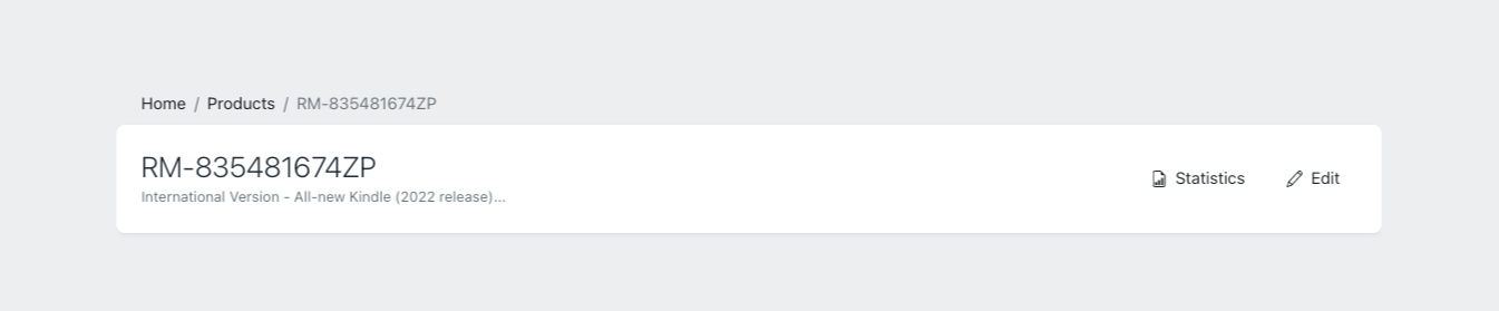
This approach enhances the overall readability and usability of the product preview screen, making it more efficient and effective for the intended audience.
Lorem Ipsum
When writing text for prototypes, it’s important to keep it realistic. Avoid using names and addresses that are too short or that only just fit in the available fields. Use real messages and errors, rather than just placeholder text like “Here is the error text”.
It’s also important to avoid using “cool” or rude names, especially in prototypes that will be used for testing. Making factual or logical errors can also be problematic, as an expert in the field (such as an accountant) will immediately notice any inconsistencies. These kinds of errors can lead to discussions with the usability specialist and may interfere with the overall user experience.
Naming Menu Items
Menu items should have names that are either actions or locations, never descriptions. Make sure menu items are concise, but also fully describe the action that will be performed when they are clicked.
“Settings” is acceptable as it clearly describes the action that will be performed when the item is clicked. “Software Up to Date” is not acceptable. What happens if I click this item? Where will it take me? What will it do? The outcome is uncertain.
Terms
Use the same words for objects and actions on them. If the user reads “certificate” in one window, “electronic signature” in another, and “key” in a third, he will not make the connection between these words, he will not understand that they are the same thing.
Although a term may be commonly used within your business circle, it’s important to recognize that not everyone may be familiar with it. As such, it’s recommended to include a small footnote alongside the term to provide an explanation:
