

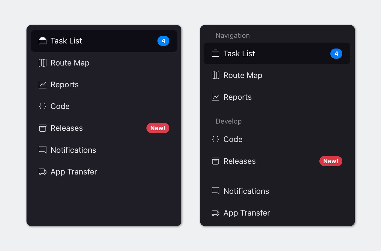
Navigation
Suggest EditSidebar Menu
Menus are a crucial component of the graphical user interface, serving as the primary means of navigation for app. They provide users with a clear understanding of their current location and enable them to explore other areas of the app.
Menus also indicate the user’s current profile. To ensure maximum usability, the menu should always be open and not collapsible, since few icons are universally recognized by users.
To ensure that your menus are as effective and user-friendly as possible, here are some key recommendations to keep in mind:
Keep the menu focused on navigation: A menu is primarily meant to provide users with a quick and easy way to navigate your app. As such, it’s important to avoid cluttering your menu with items that don’t serve this purpose, such as buttons to action forms or modal dialogs. Instead, focus on providing users with clear, easy-to-understand links that help them move seamlessly through your app.
Put your users first: Arrange your menu items in a way that makes the most sense for your app’s users. This means placing the most frequently used or relevant items at the top of the list, so that users can quickly find what they need.
Keep it simple: While vertical menus can accommodate a large number of items, it’s best to keep your menu list as short as possible. Aim for no more than 16 items, to ensure that users can easily scan and navigate the menu.
Highlight the active item: When a user navigates to a child screen, the active menu item should remain highlighted so that users can easily keep track of where they are in the app. This simple touch can greatly enhance the user experience and prevent confusion. If a user goes to edit their profile, the “User Management” item should still be active.
Group items logically: Grouping related items together in the menu can help users quickly find what they need. For instance, if you have an e-commerce app, consider grouping all product-related functions together in a “Products” or “Shop” menu. This logical grouping can greatly enhance the user experience and make your app more intuitive to use.
Breadcrumbs
Breadcrumbs are an important element of app design that help users navigate through nested menus and content with ease. These navigational aids appear at the top of the screen and show users their current location within the app, along with a clear path to their current page or content.
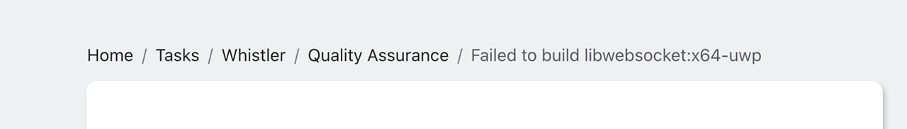
In most cases, including breadcrumbs in your app design is highly recommended, as they enable users to quickly and easily navigate back to previous pages or content, without relying on the back button or other navigation tools. The only exception to this rule is the home page, where breadcrumbs aren’t necessary, as there are no previous pages or content to navigate back to.
That being said, there may be some instances where breadcrumbs aren’t needed. For example, if your app follows a linear flow with no nested menus or pages, breadcrumbs may not add much value to the user experience. In such cases, it’s important to evaluate whether breadcrumbs are truly necessary for your app’s specific design and navigation patterns.
Command Bar
Command Bar is a horizontal button bar with hierarchical drop-down menus. Menu items can either trigger an action or open a dropdown menu.
Usage recommendations:
- Use icons sparingly. Most actions are difficult to reliably represent with icons, and the benefit of icons in addition to text should be weighed against the additional visual noise this creates.
- Menu items in dropdown menus should always have text labels.
- Icon-only menu buttons should be primarily used for extremely common recurring actions with highly standardized, universally understood icons (for example, a cross for close).
- Command Bar is not an input field! While it may resemble one in some cases, it should always be used for navigation and triggering actions, rather than accepting user input.
Hiding an unavailable action entirely is often preferable to a disabled button, as this reduces UI clutter. However, in certain situations this can be problematic:
- If the user expects a button to be present, such as at the end of a form, hiding the button can cause confusion, even if the form clearly indicates the presence of one or more invalid fields.
- As a hidden button doesn’t occupy any space in the UI, toggling its visibility can cause unwanted changes in the layout of other elements.
