

Presentation Table
Suggest EditTables are not usually winners of a UI beauty contest — they are a utilitarian part of our designs. To take advantage of their functionality and maintain their aesthetic appearance, follow the recommendations described on this page.
Maintain Consistency Throughout
Consistency is key to delivering an optimal user experience in any project. To ensure consistency, you should apply the same table format to repeating elements across different tables. Inconsistencies in date formats, for instance, can cause confusion for users. For example, using YYYY-MM-DD in one table and DD-MM-YYYY in another is not ideal.
In addition to formatting, consistency should also be maintained in terms of the location of elements within tables. If a date appears as the last column in one table, it should be in the same position in other tables.
Consistency in user interactions is also important. If a user expects a click to open a modal window in one table, they should expect the same action in another table with similar elements.
In short, establish a standard and stick to it for consistent and seamless user experience.
Text Hierarchy (Find Records)
When searching for records that meet specific criteria, users may be looking for a specific item with known details or multiple items that fit certain criteria. They may filter, sort, use a search feature, or scan the table visually to find what they need. The method chosen will depend on the specifics of the data table and the user’s expectations of what will be the easiest way to find what they’re looking for.
To design for this task, keep a few things in mind:
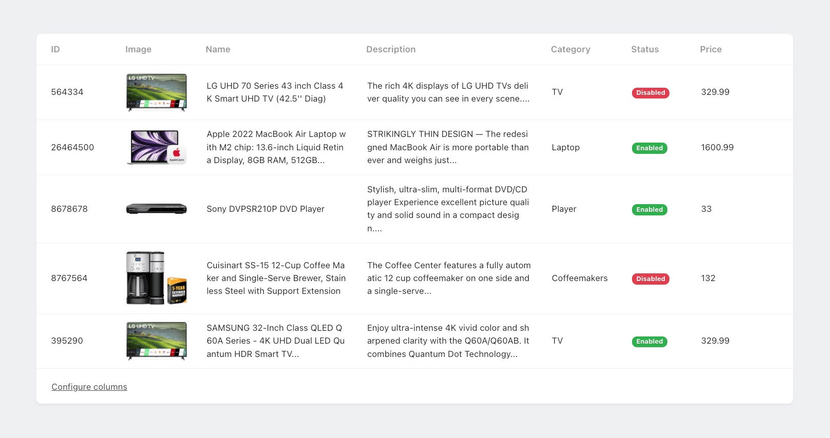
Make the first column a human-readable record identifier rather than an automatically generated ID. This makes it easier for users to find the record they’re interested in.
Order the columns based on their importance to the user, with related columns next to each other. This prevents the need to move back and forth between distant columns to view relevant data.
Place the filter as close to the table as possible.
Creating text hierarchy is important in table design to ensure a clear and organized presentation of data. The size and weight of the text in each cell should reflect its level of importance, with the largest and boldest text being the most significant and the smallest and lightest text being the least important. This hierarchy guides the user’s eye through the table and helps them understand the data in an organized manner.
Maximizing Cell Content
Unlike an Excel (And other) spreadsheet, a web-based table allows for seamless filtering and organization of information, so adding as much information to each cell as possible is not a problem. Additionally, the information can be divided into several columns at any time if needed, making it easy to adjust the layout to meet the user’s needs.
Maximizing the information in each cell can greatly enhance the overall functionality and user experience of a table.
Alignment Principles
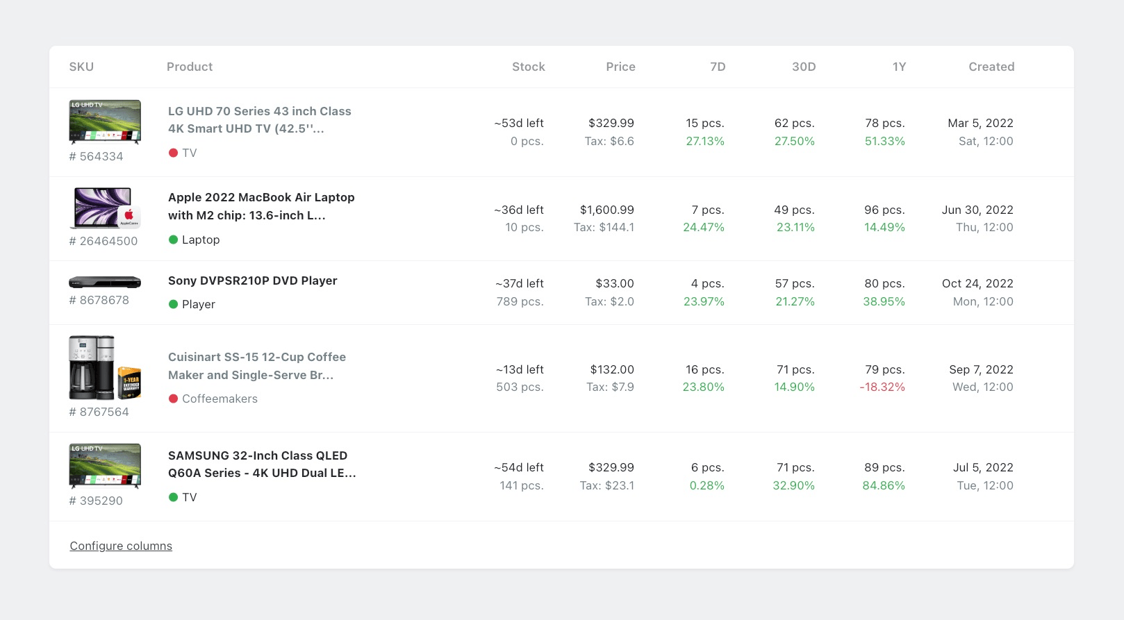
It is recommended to follow a consistent alignment strategy throughout your interface to create a visually harmonious and easy-to-read design. In general, text should be left-aligned and numbers should be right-aligned. This standard alignment approach helps guide the reader’s eye and enhances readability.
While there may be situations that warrant deviating from this rule, it is best to reserve center-aligned text for specific design elements, such as headlines and subheadings. The irregular left and right margins created by center-aligned text can be disruptive to the reader’s eye and make it difficult to scan through information efficiently.
When dealing with cells that contain multiple rows, aim to use the same number of rows across all cells. If this is not possible, arrange the cells with the greatest height at the start of the row.
Compare Data
Tables are most effective when they allow easy comparison of data, whether between records or columns. This comparison helps detect relationships between variables or simply understand typical values.
However, there are two common challenges that users face when comparing data in complex, large tables:
- Understanding which cell belongs to which record due to the overwhelming volume of data on the screen.
- Comparing columns that are far away from each other, requiring tedious scrolling and memorization of data.
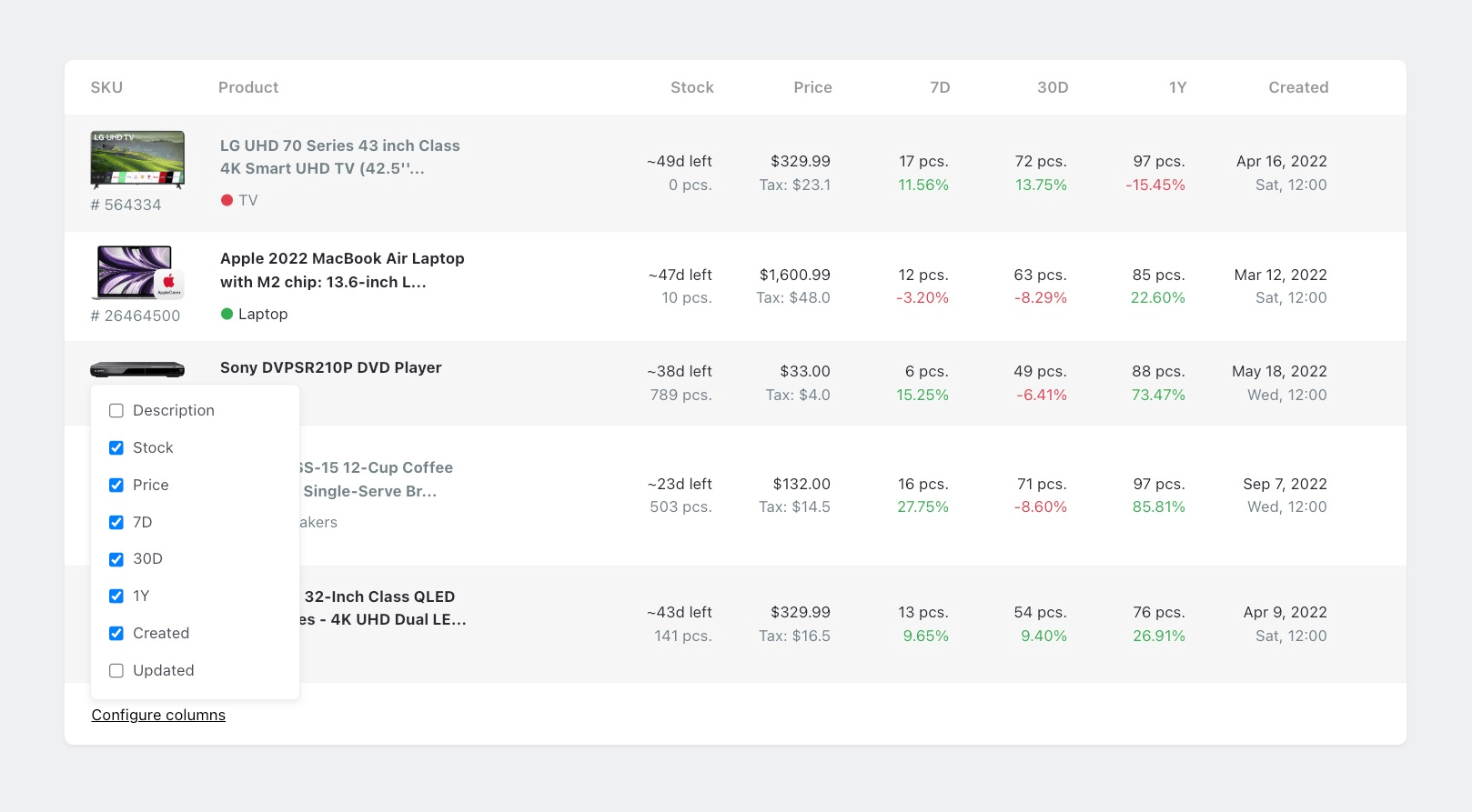
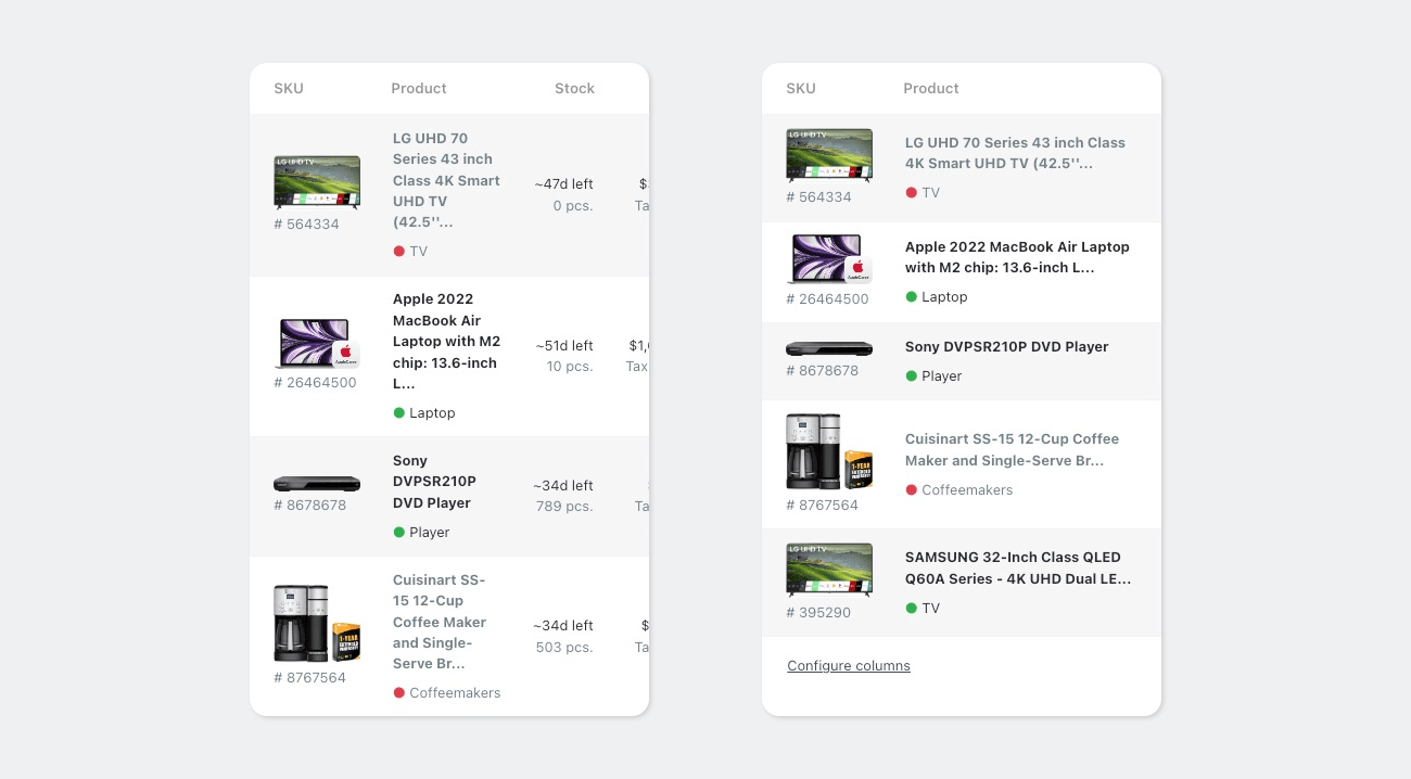
To enhance the process of data comparison, Orchid offers the option to dynamically enable or disable the display of columns. This makes it easier to focus on the most important data and avoid being overwhelmed by irrelevant information. When using this feature, it’s advisable to exercise caution and only hide columns that are less crucial to your comparison goals.
Accessing Single Record
A frequent task in tables is accessing or modifying the data in a single record. To make this task more efficient, it’s important to present the single record in a way that is easy to read and edit.
In Orchid, the recommended approach is to display the record in a modal window. This approach provides a clear and organized display of the record’s data, making it easier to view or edit.
Row Limitations
It is recommended to limit the number of rows displayed in a table to a single screen view. Exceeding this limit can negatively impact the performance of the table and hinder the user’s ability to understand the data being presented. This is because long tables often result in the loss of the table headers, which provide crucial context and information about the data being displayed. To ensure an optimal user experience, aim to keep the number of rows in a table within a single screen view.
Define Perfect Width
When designing tables for your app, it’s important to consider the size of the columns to ensure that the content is displayed effectively. While some tables may have columns that can be automatically sized, this isn’t always the best option. Instead, it’s important to determine the appropriate dimensions based on the content being displayed, particularly on mobile devices where screen real estate is limited.
Take the time to analyze your table content and consider which columns are most important and how much space they require. For example, if you have a table that displays product information, you may want to give more space to the product name and description columns, while reducing the width of columns that contain less critical information such as date or time.
By thoughtfully considering the dimensions of your table columns, you can create a more effective and user-friendly interface that helps users quickly find and understand the information they need.
