

Modal Dialogs
Suggest EditA modal dialog is a browser-like dialog that appears on top of the page in response to user actions, blocking access to the main content until dismissed.
When to Use
Modals are designed to temporarily focus the user’s attention on a single task. Typical use cases include:
- Confirmations (for example, “Are you sure you want to delete this item?”)
- Lightweight forms (for example, entering one or a few values)
- Quick information summaries (for example, notifications or alerts)
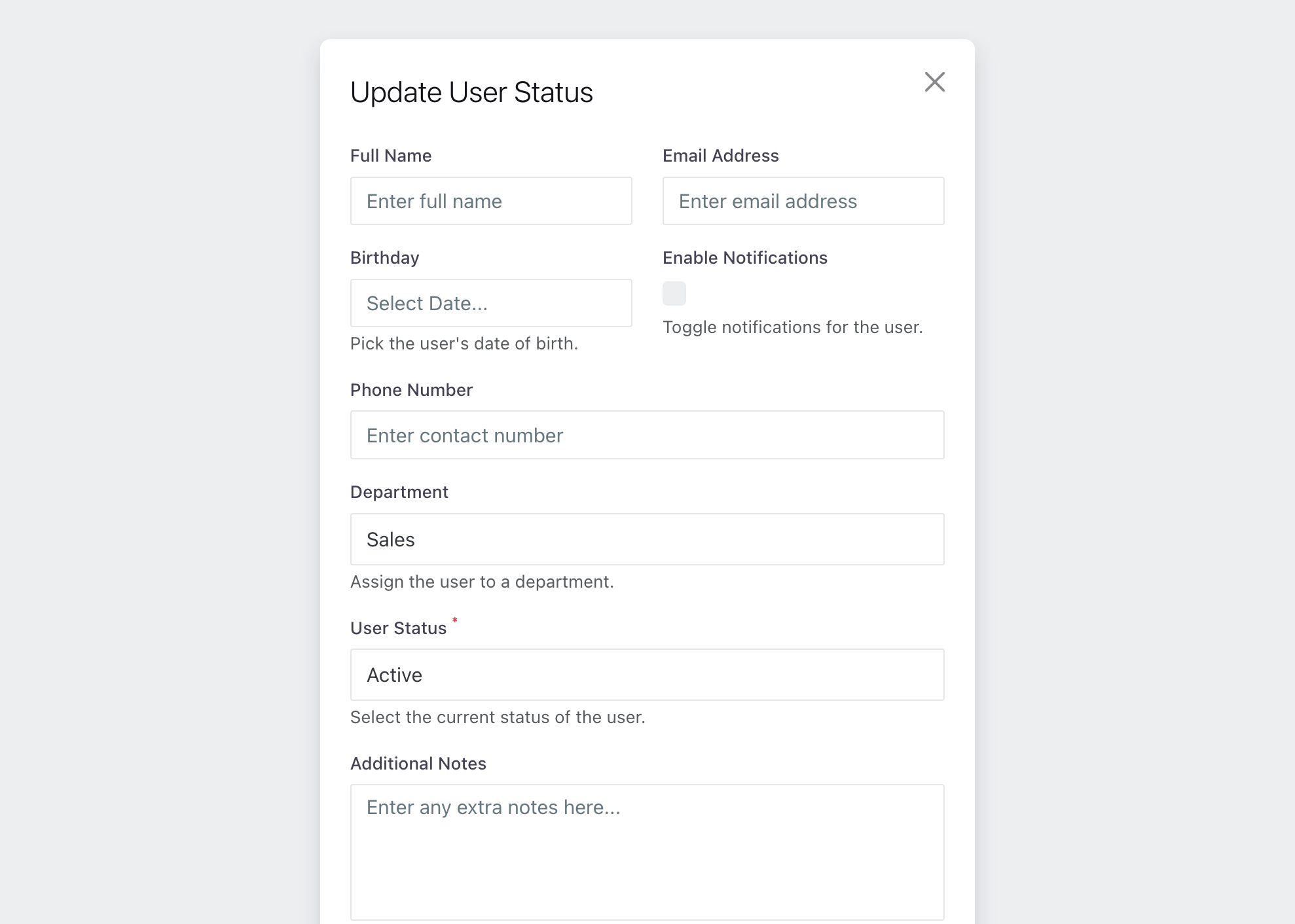
Avoid using modals for complex interactions, such as detailed data views, tables with filtering/sorting, or multi-page navigation. Doing so disrupts natural workflows and creates unnecessary friction.
Also, avoid situations where modal content exceeds the height of the screen at minimum supported resolutions. In such cases, place the content on a separate page instead.
All links inside a modal should open in a new tab (_blank) to preserve context and prevent interrupting the user’s workflow.
Opening a Modal
Modals should open only in response to explicit user actions, such as clicking a button. For automatic notifications, use less intrusive UI elements like toasts or banners.
Do not stack modals: each modal should be a standalone dialog. Opening another modal on top of an existing one causes confusion and reduces usability.
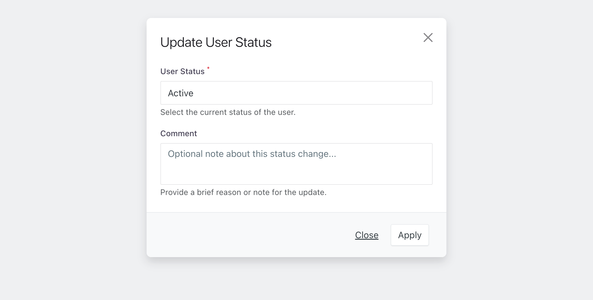
Title
If a modal is intended for a single task, the title should reflect it. Keep titles short (1–3 words) and describe the process or object.
Buttons and Actions
Buttons in modals define how the user completes or cancels the current action. The number and labeling of buttons directly impact decision speed and confidence. Well-labeled buttons make interactions predictable and intuitive.
Number of Actions
Each modal should have no more than two primary buttons:
- Confirm (primary action) — performs the task or saves changes.
- Cancel (secondary action) — closes the modal without saving.
Avoid extra or unclear buttons. Modals are meant for short, focused tasks, not complex scenarios.
Button Labels
Button labels should clearly describe the result of the action. Avoid abstract words like “OK” or “Yes”.
Use verbs in the imperative mood.
| ✅ Correct    | ❌ Incorrect |
|--------------|--------------|
| Apply        | OK           |
| Save         | Yes / No     |
| Continue     | Done         |
| Delete       | Enter        |
| Submit       | Submitting   |
| Confirm      |              |
| Retry        |              |
Examples of good button pairs for different scenarios:
| Scenario          | Left Button | Right Button |
|-------------------|-------------|--------------|
| Confirmation      | Cancel      | Delete       |
| Form              | Close       | Apply        |
| Data Editing      | Cancel      | Save         |
Clear button labels reduce cognitive load and help users act confidently.
Closing a Modal
Provide multiple ways for the user to close the modal, ensuring control and ease of use:
- Cancel or Close button
- Close icon (
✖) in the top-right corner - Escape key on the keyboard
Avoid automatically dismissing modals with a timeout — users may not have enough time to read the content or could miss critical information.
