

Form Elements
Suggest Edit- Label
- Introduction to Input
- Designing Input Interfaces
- Required Fields
- Hiding Input Fields
- Types of Input
- Masking Input Values
- Range
- TextArea
- Password
- CheckBox
- Switcher
- Select
- Radio
- Relation
- DateTime
- Direct Input
- Date Format
- Time Selection
- Time Selection Only
- Range Selection
- Quick Date Selection
- Allow Empty Values
- Multiple Selection
- DateRange
- TimeZone
- Quill WYSIWYG Editor
- Toolbar Controls
- Extensibility
- Markdown Editor
- Matrix
- Customizing Column Headers
- Limiting Rows
- Custom Fields
- Code editor
- Picture
- Cropper
- Width and Height
- File Size Limit
- Value
- Attach
- File Upload Limitations
- File Grouping
- File Storage
- Explicit File Path Configuration
- File Validation and Sorting on the Server
- Error Handling and Message Display
- Map
- UTM
- Group
- Column Width
- Column Alignment
- Button
- Action Confirmation
- Submission URL
- File Download
- Link
- Opening Link in a New Tab
- File Download
- Dropdown Menu
- NumberRange
- Custom Fields Creation
Fields are used to generate the output of the fill and edit form template. Form elements are the building blocks of a user interface, and they allow you to create different parts of the interface and provide interaction with the user. In this section, we will cover of the most common form elements and their usage.
Feel free to add your fields, for example, to use the convenient editor for you or any components.
Label
The Label field displays read-only text or a heading. Use it for section titles, hints, or to show a value that the user cannot edit.
use Orchid\Screen\Fields\Label;

Label::make('section_title')
    ->title('Shipping address');
You can bind a value from the screen’s query so the label shows dynamic content (for example, a customer name). The same methods (title(), help(), popover(), vertical()) are available as on other fields. Labels are often used inside reusable row layouts to separate groups of fields.
Introduction to Input
Input is one of the most versatile form elements. It allows you to create text fields, as well as other types of input such as number, email, password, etc. Here is an example of creating a simple text input field:
Example:
use Orchid\Screen\Fields\Input;

Input::make('name');
Designing Input Interfaces
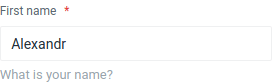
Empty and expressionless input fields can confuse the user, but you can help by specifying a title. The title should be a short and descriptive label that clearly communicates the purpose of the field. Here is an example of how to add a title to an input field:
Input::make('name')
    ->title('First name');
If you need to provide additional context or instructions for the field, you can use the help method to add a hint or brief description. The hint should be a short and concise message that helps the user understand the purpose or format of the field. Here is an example of how to add a hint to an input field:
Input::make('name')
    ->help('What is your name?');
If the field requires a more detailed explanation or guidance, you can use the popover method to add a tooltip that will be displayed as a pop-up when the user hovers over the field. The tooltip should provide additional information or instructions that help the user complete the field correctly. Here is an example of how to add a tooltip to an input field:
Input::make('name')
    ->popover('Tooltip - hint that user opens himself.');
By default, form elements are displayed in a horizontal layout, with the label and input field side by side. However, you can change the layout to a vertical arrangement by using the vertical() method:
Input::make('name')->vertical();
If you prefer the horizontal layout, you can use the horizontal() method to restore it:
Input::make('name')->horizontal();
Required Fields
Sometimes you may need to specify that a field is required, meaning that the user must enter a value in the field before they can submit the form. To mark a field as required, you can use the required() method:
Input::make('name')
    ->type('text')
    ->required();
You can also use the required() method on other types of form elements, such as select, radio buttons, and checkboxes.
Hiding Input Fields
There may be times when you want to hide a form element from the user interface, either temporarily or permanently. To hide a form element, you can use the canSee() method and pass a value of false:
Input::make('name')->canSee(false);
If you want to show a previously hidden form element, you can use the canSee() method and pass a value of true:
Input::make('name')->canSee(true);
Note that many methods, such as
canSee,required,title,help,vertical,horizontaland many others, are available in almost everyfieldof the system.
Types of Input
The input field is one of the most flexible fields. You can use it for text, file, hidden, and color values. It also supports email, number, range, and URL values. The type attribute determines the kind of input field you want to create and the kind of data it accepts. Here are some examples of using the type method:
Input::make('name')->type('text');
A field for entering the name of the file that is sent to the server.
Input::make('name')->type('file');
Hidden field.
Input::make('name')->type('hidden');
Widget for choosing a color.
Input::make('name')->type('color');
For email addresses.
Input::make('name')->type('email');
Entering numbers.
Input::make('name')->type('number');
Slider to select numbers in the specified range.
Input::make('name')->type('range');
To specify web addresses.
Input::make('name')->type('url');
Please note. Please note that support for new HTML5 attributes such as
colorandrangeis dependent on the browser being used. You can learn more about attribute types at Mozilla’s website.
Masking Input Values
A mask is a useful tool for enforcing a specific format for user input. For example, you might want to use a mask to ensure that phone numbers are entered in a standard format, or that currency values are entered with the correct number of decimal places.
To use a mask with an input field, you can use the mask() method and pass a string that defines the format of the input. The string should contain placeholders for the allowed characters and any fixed characters that should be included. Here is an example of using a mask to enforce a standard phone number format:
Input::make('phone')
    ->mask('(999) 999-9999')
    ->title('Phone number');
You can also pass an array of options to the mask() method to customize the behavior of the mask. For example, you can use the numericInput option to specify that only numeric characters should be accepted:
Input::make('price')
    ->title('Price')
    ->mask([
        'mask' => '999 999 999.99',
        'numericInput' => true
    ]);
You can also use the alias option to use a predefined mask, such as currency, which automatically formats the input as a currency value:
Input::make('price')
    ->title('Price')
    ->mask([
        'alias' => 'currency',
        'prefix' => ' ',
        'groupSeparator' => ' ',
        'digitsOptional' => true,
    ]);
You can view all of the available options for the Inputmask library here.
Range
The Range field displays a numeric slider. Use it when the value is bounded and a visual slider is appropriate:
use Orchid\Screen\Fields\Range;

Range::make('volume')
    ->min(0)
    ->max(100)
    ->step(1)
    ->title('Volume');
You can also use Input::make('volume')->type('range') for a native HTML5 range input. The Range field provides a consistent Orchid-style interface.
TextArea
The textarea field is a form element that allows the user to enter multiple lines of text. It is similar to the input field, but it is designed to accept longer pieces of text and to preserve line breaks.
To create a textarea field, you can use the TextArea class:
use Orchid\Screen\Fields\TextArea;

TextArea::make('description');
By default, the textarea field will expand to fit the amount of text that is entered. However, you can use the rows method to specify a minimum number of rows:
TextArea::make('description')
    ->rows(5);
This can be useful for providing a clear visual indication of the amount of text that is expected.
As with other form elements, you can use methods such as title(), help(), and popover() to add additional context and guidance for the user. You can also use the required() method to mark the textarea field as required and the canSee() method to show or hide the field.
Password
The Password field is a text input that masks the value for sensitive data such as passwords:
use Orchid\Screen\Fields\Password;

Password::make('password')
    ->title('Password')
    ->required()
    ->placeholder('Enter password')
    ->help('Minimum 8 characters.');
Use title(), placeholder(), help(), and required() as with other fields.
CheckBox
A checkbox is a graphical user interface element that allows the user to control a parameter with two states – checked and unchecked. Checkboxes are often used to represent binary choices, such as whether a particular feature is enabled or disabled.
To create a checkbox field, you can use the CheckBox class:
use Orchid\Screen\Fields\CheckBox;

CheckBox::make('free')
    ->value(1)
    ->title('Free')
    ->placeholder('Event for free')
    ->help('Event for free');
The value attribute determines the value that will be sent to the server when the checkbox is checked. The title attribute provides a label for the checkbox, and the placeholder attribute can be used to provide a default value or a short description. The help attribute can be used to provide additional context or instructions for the user.
By default, browsers do not send the value of an unchecked checkbox when the form is submitted. This can make it difficult to use checkboxes with simple Boolean values. To solve this problem, you can use the sendTrueOrFalse() method, which will send the value false to the server when the checkbox is unchecked:
CheckBox::make('enabled')
    ->sendTrueOrFalse();
This can be useful for ensuring that the server receives a clear indication of the state of the checkbox.
Switcher
The Switcher field renders a toggle ideal for boolean options such as “Enabled” or “Allow notifications.” It is well-suited for settings screens where a single on/off choice is needed.
use Orchid\Screen\Fields\Switcher;

Switcher::make('notifications_enabled')
    ->title('Email notifications')
    ->sendTrueOrFalse()
    ->help('Receive email when someone comments.');
By default, an unchecked checkbox does not send a value. Use sendTrueOrFalse() so the server receives true or false for the field.
Note. For a list of multiple checkable options, use the CheckBox field. For a single on/off setting, Switcher is often the better choice.
Select
The select field is a form element that allows the user to choose an option from a dropdown list. It is useful for presenting a limited set of options and allowing the user to make a selection.
To create a select field, you can use the Select class:
use Orchid\Screen\Fields\Select;

Select::make('select')
    ->options([
        'index'   => 'Index',
        'noindex' => 'No index',
    ])
    ->title('Select tags')
    ->help('Allow search bots to index');
The options attribute is an array that defines the options that will be presented in the dropdown list. The keys of the array are the values that will be sent to the server, and the values are the labels that will be displayed to the user.
In addition to using an array of options, you can also use a data source to populate the options of a select field. For example, you can use a model to retrieve the options:
Select::make('user')
    ->fromModel(User::class, 'email');
This will retrieve all records from the User model and use the email field as the label for each option. You can also use a custom query to retrieve the options:
Select::make('user')
    ->fromQuery(User::where('balance', '!=', '0'), 'email');
This will retrieve all records from the User model where the balance field is not equal to 0, and use the email field as the label for each option.
You can also specify a different field to use as the key for each option using the fromModel() and fromQuery() methods:
Select::make('user')
    ->fromModel(User::class, 'email', 'uuid');
This will use the uuid field as the key for each option, rather than the default primary key.
If you want to provide an option that represents an unselected state, you can use the empty() method:
// For array
Select::make('user')
    ->options([
        1  => 'Option 1',
        2  => 'Option 2',
    ])
    ->empty('No select');

// For model
Select::make('user')
    ->fromModel(User::class, 'name')
    ->empty('No select');
The empty method also accepts the second argument, which is responsible for the value:
Select::make('user')
    ->empty('No select', 0)
    ->options([
        1  => 'Option 1',
        2  => 'Option 2',
    ]);
Allow custom values with the allowAdd method:
Select::make('type')
    ->allowAdd()
    ->options([
        'Option 1',
        'Option 2',
    ]);
Radio
Use the Radio field for a single choice from a fixed set of options. Each option is displayed as a radio button:
use Orchid\Screen\Fields\Radio;

Radio::make('status')
    ->options([
        'draft'   => 'Draft',
        'pending' => 'Pending',
        'published' => 'Published',
    ])
    ->value('draft')
    ->title('Status');
For a horizontal group of radio buttons in a single row, you can use the RadioButtons class or place multiple Radio fields inside a Group. Use descriptive labels for accessibility.
Relation
Relations fields can load dynamic data, this is a good solution if you need connections.
use Orchid\Screen\Fields\Relation;

Relation::make('idea')
    ->fromModel(Idea::class, 'name')
    ->title('Choose your idea');
For multiple selections, use the multiple() method.
Relation::make('ideas.')
    ->fromModel(Idea::class, 'name')
    ->multiple()
    ->title('Choose your ideas');
Note. Note the dot at the end of the name. It is necessary to show the expected array shape, similar to the HTML code
<input name='ideas[]'>.
To modify the load, you can use the reference to the scope model, for example, take only active:
namespace App;

use Illuminate\Database\Eloquent\Attributes\Scope;
use Illuminate\Database\Eloquent\Builder;
use Illuminate\Database\Eloquent\Model;

class Idea extends Model
{
    #[Scope]
    protected function active(Builder $query): void
    {
        $query->where('active', 1);
    }
}
Relation::make('idea')
    ->fromModel(Idea::class, 'name')
    ->applyScope('active')
    ->title('Choose your idea');
You can also pass additional parameters to the method:
Relation::make('idea')
    ->fromModel(Idea::class, 'name')
    ->applyScope('status', 'active')
    ->title('Choose your idea');
You can add one or several fields, which will be additionally searched for:
Relation::make('idea')
     ->fromModel(Idea::class, 'name')
     ->searchColumns('author', 'description')
     ->title('Choose your idea');
To set the number of items that will be listed as a result of a search, you can chain the method chunk, passing the number of search results as a param:
Relation::make('users.')
    ->fromModel(User::class, 'name')
    ->chunk(20);
Selection options can work with calculated fields, but only to display the result, the search will occur only on one column in the database. To do this, use the displayAppend method.
namespace App;

use Illuminate\Database\Eloquent\Model;

class User extends Model
{
    public function getFullAttribute(): string
    {
        return sprintf('%s (%s)', $this->name, $this->email);
    }
}
To indicate the displayed field you must:
Relation::make('users.')
    ->fromModel(User::class, 'name')
    ->displayAppend('full')
    ->multiple()
    ->title('Select users');
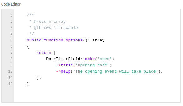
DateTime
The DateTime field provides a streamlined interface for selecting both date and time within your Laravel applications, leveraging the robust functionality of the flatpickr JavaScript library.
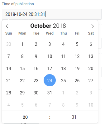
To create a DateTime field, utilize the DateTimer class:
use Orchid\Screen\Fields\DateTimer;

DateTimer::make('open')
    ->title('Opening date');
Direct Input
Enable direct input to allow users to manually enter:
DateTimer::make('open')
    ->title('Opening date')
    ->allowInput();
Note: enabling direct input can also make the field mandatory:
DateTimer::make('open')
    ->title('Opening date')
    ->allowInput()
    ->required();
Date Format
Customize the date format using the format() method:
DateTimer::make('open')
    ->title('Opening date')
    ->format('Y-m-d');
Define the format for transmitting values to the frontend with the serverFormat() method:
DateTimer::make('open')
    ->serverFormat('Y-m-d H:i:s');
Opt to display time in 24-hour format:
DateTimer::make('open')
    ->title('Opening date')
    ->format24hr();
Time Selection
Enable selection of both date and time using the enableTime() method:
DateTimer::make('open')
    ->title('Opening time')
    ->enableTime();
Time Selection Only
If only time selection is required:
DateTimer::make('open')
    ->title('Opening time')
    ->noCalendar()
    ->format('h:i K'); // Specify time format
Range Selection
Allow users to select a range for dates and times:
DateTimer::make('open')
    ->format('Y-m-d H:i')
    ->enableTime()
    ->format24hr()
    ->range();
Quick Date Selection
Facilitate easy selection with predefined quick date options:
DateTimer::make('open')
    ->format('Y-m-d H:i')
    ->enableTime()
    ->format24hr()
    ->range()
    ->withQuickDates([
        'Today'     => now(),
        'Yesterday' => now()->subDay(),
        'Last Week' => [now()->startOfDay()->subWeek(), now()->endOfDay()],
    ]);
Allow Empty Values
Allow the field to remain empty:
DateTimer::make('open')
    ->format('Y-m-d')
    ->allowEmpty()
    ->multiple();
Multiple Selection
Permit multiple date selections:
DateTimer::make('open')
    ->format('Y-m-d')
    ->allowEmpty()
    ->multiple();
DateRange
Allows you to select a range of date (and time).
Example:
use Orchid\Screen\Fields\DateRange;

DateRange::make('open')
    ->title('Opening between');
Default value / result is an array with keys of start, end.
DateRange::make('open')
    ->title('Opening between')
    ->value(['start' => now()->subDays(30), 'end' => now()]),
TimeZone
The TimeZone field is a form element that allows the user to choose a time zone from a dropdown list. It is useful for selecting the time zone in which an event or action will take place.
use Orchid\Screen\Fields\TimeZone;

TimeZone::make('time');
This will create a dropdown list of all available time zones. You can also specify a specific set of time zones to include in the list using the listIdentifiers() method:
use DateTimeZone;

TimeZone::make('time')
    ->listIdentifiers(DateTimeZone::ALL);
The listIdentifiers() method takes a constant from the DateTimeZone class as an argument. The default value is DateTimeZone::ALL, which includes all available time zones. Other possible values are:
DateTimeZone::AFRICA;
DateTimeZone::AMERICA;
DateTimeZone::ANTARCTICA;
DateTimeZone::ARCTIC;
DateTimeZone::ASIA;
DateTimeZone::ATLANTIC;
DateTimeZone::AUSTRALIA;
DateTimeZone::EUROPE;
DateTimeZone::INDIAN;
DateTimeZone::PACIFIC;
DateTimeZone::UTC;
DateTimeZone::ALL_WITH_BC;
DateTimeZone::PER_COUNTRY;
The representation of variable zones can be found in the documentation PHP.
Quill WYSIWYG Editor
The Quill rich-text editor offers a seamless solution for integrating rich text editing capabilities into your web applications. With Quill, users can effortlessly insert images, apply text styling, embed videos, and more.
To create a Quill editor instance, simply utilize the Quill field. Here’s an example of how to implement it in your code:
use Orchid\Screen\Fields\Quill;

Quill::make('html');
Toolbar Controls
Quill provides a comprehensive set of controls organized into six groups, empowering users with diverse editing functionalities. These groups include:
- Text: Tools for basic text formatting such as bold, italic, underline, and strikethrough.
- Color: Options for adjusting text and background color.
- Header: Tools for styling text as headers.
- List: Controls for creating ordered and unordered lists.
- Format: Additional formatting options like alignment and indentation.
- Media: Features for inserting multimedia content such as images and videos.
You can customize the toolbar by specifying which groups of controls to display. Here’s how you can configure the toolbar in your code:
Quill::make('html')
    ->toolbar(["text", "color", "header", "list", "format", "media"]);
Extensibility
One of the strengths of Quill is its extensibility through plugins. You can enhance the editor’s functionality by installing additional plugins. This can be easily accomplished using a JavaScript file.
document.addEventListener('orchid:quill', (event) => {
    // Object for registering plugins
    event.detail.quill;

    // Parameter object for initialization
    event.detail.options;
});
Note: you can add custom scripts and stylesheets through the platform.php config file.
Example for quill-image-compress:
Add the following in config/platform.php into the resource.scripts array
"https://unpkg.com/quill-image-compress@1.2.11/dist/quill.imageCompressor.min.js",
"/js/admin/quill.imagecropper.js",
create a quill.imagecropper.js in public/js/admin with the following content
document.addEventListener('orchid:quill', (event) => {
    // Object for registering plugins
    event.detail.quill.register("modules/imageCompressor", imageCompressor);

    // Parameter object for initialization
    event.detail.options.modules = {
         imageCompressor: {
            quality: 0.9,
            maxWidth: 1000, // default
            maxHeight: 1000, // default
            imageType: 'image/jpeg'
        }
    };
});
Markdown Editor
The Markdown editor field is a powerful tool for creating and editing text using the Markdown markup language. Markdown offers a simple and intuitive syntax that allows users to focus on content creation without getting bogged down by complex formatting.
To create a Markdown editor field, you can use the SimpleMDE class:
use Orchid\Screen\Fields\SimpleMDE;

SimpleMDE::make('markdown');
Matrix
The Matrix field provides a user-friendly interface for editing tabular data, offering flexibility and convenience. It’s particularly useful for scenarios where you need to manage structured data within a flat table format, such as storing information in a JSON column type.
You can easily create a Matrix field by specifying the column headers. Here’s an example of how to define a Matrix field with columns:
use Orchid\Screen\Fields\Matrix;

Matrix::make('options')
    ->columns([
        'Attribute',
        'Value',
        'Units',
    ]);
Customizing Column Headers
In some cases, the values of the columns may differ from what needs to be displayed in the headers. You can address this by specifying keys for the columns:
Matrix::make('options')
    ->columns([
        'Attribute' => 'attr',
        'Value' => 'product_value',
    ]);
Limiting Rows
You can also set a maximum number of rows, after which the add button will be disabled:
Matrix::make('options')
    ->columns(['id', 'name'])
    ->maxRows(10);
Custom Fields
By default, each cell in the Matrix field contains a textarea element. However, you can customize the field types according to your requirements:
Matrix::make('users')
    ->title('Users list')
    ->columns(['id', 'name'])
    ->fields([
        'id'   => Input::make()->type('number'),
        'name' => TextArea::make(),
    ]);
It’s important to note that the Matrix field performs field copying on the client side. While this works seamlessly for simple input and select fields, it may encounter limitations with complex or compound fields.
Code editor
A field for writing program code with the ability to highlight.
Example:
use Orchid\Screen\Fields\Code;

Code::make('code');
To specify code highlighting for a specific programming language, you can use the language() method.
Code::make('code')
    ->language(Code::CSS);
The following languages are available:
- Markup –
markup,html,xml,svg,mathml - CSS –
css - C-like –
clike - JavaScript –
javascript,js
The number of lines is supported:
Code::make('code')
    ->lineNumbers();
Picture
Allows you to upload an image.
Example:
use Orchid\Screen\Fields\Picture;

Picture::make('picture');
You can specify the storage backend for the uploaded image using the storage method:
Picture::make('picture')
    ->storage('s3');
Use the acceptedFiles method to define the types of files that the field should accept. This is done using unique file type specifiers.
For example, to only allow JPEG images, you can use the following code:
Picture::make('picture')
    ->acceptedFiles('.jpg');
Cropper
Extends Picture and allows you to upload an image and crop to the desired format.
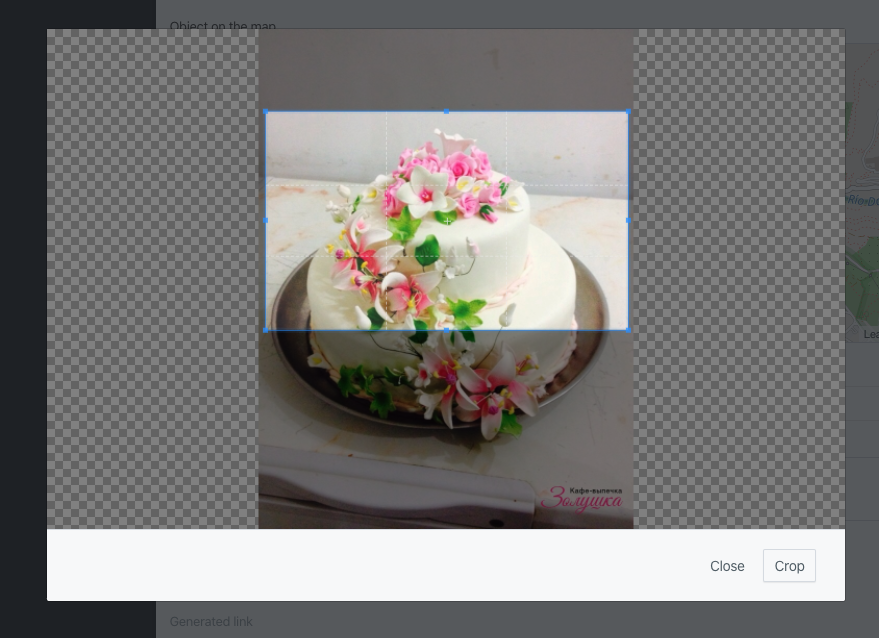
Example:
use Orchid\Screen\Fields\Cropper;

Cropper::make('picture');
Width and Height
To control the format, you can specify the width and height of the desired image:
Cropper::make('picture')
    ->width(500)
    ->height(300);
Or you can impose specific limits using minWidth / maxWidth or minHeight / maxHeight or use convenience methods minCanvas / maxCanvas
Cropper::make('picture')
    ->minCanvas(500)
    ->maxWidth(1000)
    ->maxHeight(800);
File Size Limit
To limit the size of the downloaded file, you must set the maximum value in MB.
Cropper::make('picture')
    ->maxFileSize(2);
Value
The control of the return value is carried out using the methods:
Cropper::make('picture')
    ->targetId();
The sequence number (id) of the Attachment record will be returned.
Cropper::make('picture')
    ->targetRelativeUrl();
Will return the relative path to the image.
Cropper::make('picture')
    ->targetUrl();
Will return the absolute path to the image.
Attach
The Attach field provides an intuitive interface for uploading images and files, including support for grouping and sorting.
To create a file upload element, use the make method of the Attach class and specify the field name:
use Orchid\Screen\Fields\Attach;

Attach::make('attachments');
To allow multiple file uploads, use the multiple() method:
Attach::make('attachments')
    ->multiple();
File Upload Limitations
For multiple file uploads, you can set a maximum number of files that can be uploaded using the maxCount method:
Attach::make('attachments')
    ->multiple()
    ->maxCount(3); // 3 files
You can also limit the file size using the maxSize() method. The size is specified in megabytes (MB):
Attach::make('attachments')
    ->maxSize(1024); // Size in MB
Maximum file upload size: By default, the values for
upload_max_filesizeandpost_max_sizeare set to 2M. You can change these settings inphp.inito allow file uploads larger than 2M.
Use the accept method to specify which file types the field should accept, for example:
Attach::make('upload')
    ->accept('image/*,application/pdf,.psd');
The provided string is a list of unique file type specifiers, separated by commas.
File Grouping
You can group files by different categories using the group method. This is particularly useful if you need to upload different types of files, such as documents and images.
Attach::make('docs')
    ->group('documents');

Attach::make('images')
    ->group('photo');
To work with uploaded files that are grouped through model relationships, use the following syntax:
use Orchid\Attachment\Models\Attachment;

/**
 * Returns the attached "hero" (one-to-one).
 */
public function hero(): HasOne
{
    return $this->hasOne(Attachment::class, 'id', 'hero')
        ->withDefault();
}

/**
 * Returns documents (many-to-many).
 * Upload is handled via the group() method.
 */
public function documents(): MorphToMany
{
    return $this->attachments('documents');
}
File Storage
The upload field can work with different repositories. To do this, specify the repository key defined in config/filesystems.php:
Attach::make('upload')
    ->storage('s3');
By default, the public storage is used.
Explicit File Path Configuration
If you need to override the standard file storage rules and explicitly define the upload path, use the path method:
Attach::make('upload')
    ->path('/custom/path');
File Validation and Sorting on the Server
It’s important to validate files on the server side. For example, check that the file is an image with a specific aspect ratio or file type. To do this, use the uploadUrl method to specify the endpoint for file uploads:
Attach::make('upload')
    ->uploadUrl(route('my.upload.endpoint'));
Similarly, you can specify an endpoint for sorting files:
Attach::make('upload')
    ->sortUrl(route('my.sort.endpoint'));
Error Handling and Message Display
To ensure that users don’t encounter unclear errors, it’s important to provide clear and informative error messages. Use the errorMaxSizeMessage and errorTypeMessage methods to specify custom messages:
Attach::make('upload')
    ->errorMaxSizeMessage("File size is too large")
    ->errorTypeMessage("Invalid file type");
Map
The Map field provides an interface for selecting or displaying a location (for example, coordinates). You can set the initial zoom level and the height of the map container:
use Orchid\Screen\Fields\Map;

Map::make('location')
    ->title('Location')
    ->zoom(12)
    ->height('400px');
The field typically stores coordinates, such as latitude and longitude. The Blade view may integrate with a map provider, such as Leaflet or Google Maps, to render the map. Refer to the package resources or your custom view for provider-specific setup.
UTM
The UTM field is used to capture UTM parameters (campaign, source, medium, and related marketing fields). It is useful in forms for tracking campaign and traffic source data:
use Orchid\Screen\Fields\UTM;

UTM::make('campaign')
    ->title('Campaign parameters');
Use this field when you need to store or edit UTM metadata for analytics or marketing reports.
Group
The Group component is used to combine multiple fields into a single line, allowing for more compact and organized interfaces. This is especially useful for grouping related data, such as first and last names.
Group::make([
    Input::make('first_name'),
    Input::make('last_name'),
]),
Column Width
By default, fields will take up the full available width of the screen when you use the fullWidth method. This option is suitable for most scenarios where you need elements to fill the entire space:
Group::make([
    // ...
])->fullWidth();
However, there may be cases where you want fields to occupy only the necessary space. The autoWidth method is perfect for situations where fields contain varying amounts of data. For example, when using radio buttons:
Group::make([
    Radio::make('agreement')
        ->placeholder('Yes')
        ->value(1),

    Radio::make('contact')
        ->placeholder('No')
        ->value(0),
])->autoWidth();
For greater flexibility in configuring column widths, you can use the widthColumns() method, which supports CSS Grid. This method allows you to specify column widths using values for the grid-template-columns property:
Group::make([
    // ...
])->widthColumns('2fr 1fr');
Accepted values for widthColumns() include:
- Percentages (for example,
30%) - Pixels (for example,
120px) - Fractional units (for example,
2fr) - Other values such as
max-contentandauto
Important: The number of specified values must not be less than the number of elements in the group.
The width settings apply only on desktop devices. On mobile devices, each field will be displayed on a new line, enhancing the responsiveness of the interface and improving user experience.
Column Alignment
Columns within a group can have different heights, especially when a header is present in only one of them. To create a more visually appealing interface, it is essential to utilize column alignment.
When one of the columns has a header, aligning all columns to the bottom of the parent container will create a more harmonious look. To achieve this, use the alignEnd method:
Group::make([
    // ...
])->alignEnd();
If you want all elements to align at the top, apply the alignStart method:
Group::make([
    // ...
])->alignStart();
To ensure that the columns are aligned along the baseline of the text for consistency in content display, use the alignBaseLine method:
Group::make([
    // ...
])->alignBaseLine();
For a symmetrical appearance, center the columns using the alignCenter method:
Group::make([
    // ...
])->alignCenter();
Button
Buttons are used to submit a form filled out by the user to the server.
To create a button that calls the handler method defined in the current screen, use Button::make():
Button::make('Submit')
    ->method('handler');
The method must be available in the screen where the button is located.
If you need to pass specific data to the method, specify it as the second argument:
Button::make('Submit')
    ->method('handler', [
        'user' => 1,
    ]);
Action Confirmation
To prevent accidental actions, add the confirm() method. This will display a confirmation dialog before executing the action.
It is particularly useful for irreversible actions, such as data deletion.
Button::make('Delete')
    ->method('deleteItem')
    ->confirm('You will lose access to this item.');
Tip: Use clear and concise messaging in
confirm()so the user understands the consequences.
Submission URL
To specify the URL where the form data should be sent, use the action() method. Typically, this will be the URL of a controller within your application where the request is processed after the button is clicked.
Button::make('Submit')
    ->action('https://orchid.software');

Button::make('Submit')
    ->action(route('controller.method'));
File Download
To initiate a file download when clicking a button, use the download() method. This signals the system that the result of the method execution will be a downloadable file rather than simply displaying it in the browser.
Button::make('Download Report')
    ->method('export')
    ->download();
Link
Links (Link) are used to direct the user to another page or to perform an action, such as downloading a file.
To create a link to a specific URL, use Link::make() with the link text and the href() method:
Link::make('Visit Orchid')
    ->href('https://orchid.software');
Opening Link in a New Tab
To open a link in a new tab, add the target('_blank') method. This is useful for external sites or resources you want to open alongside the current page.
Link::make('Documentation')
    ->href('https://orchid.software/docs')
    ->target('_blank');
File Download
If the link should initiate a file download, use the download() method. This informs the browser that the link points to a downloadable file.
Link::make('Download Report')
    ->href('/path/to/report.pdf')
    ->download();
Note: Ensure the file is accessible at the specified path to avoid download errors.
Dropdown Menu
The Dropdown component allows you to create a button with a dropdown list of actions, which is convenient for grouping related actions, such as a three-dot menu for managing an item.
To create a dropdown menu, list all actions in the list() method:
DropDown::make()
    ->icon('bs.options-vertical')
    ->list([
        Link::make('Edit')
            ->route('platform.systems.users.edit', $user->id),

        Button::make('Delete')
            ->method('remove')
            ->icon('trash'),
    ]);
NumberRange
You can create ranges of numbers. Especially useful for filters.
NumberRange::make();
Usage with filters:
TD::make()->filter(NumberRange::make());
//or
TD::make()->filter(TD::FILTER_NUMBER_RANGE);
Result is an array with keys of min, max.
Custom Fields Creation
To create custom fields, refer to the “Custom Fields” page in the documentation. This page provides a straightforward guide on how to create and customize fields according to your requirements. Access the Custom Fields page for more details.
